The Viettel FC logo symbolizes the convergence of the team's values and aspirations. The use of a stylized pine branch, familiar from the Vietnamese People's Army's insignia, affirms Viettel's origins in the military and highlights the soldierly spirit as a unique identity of the Viettel FC players.
The two stars symbolize the goals of the Viettel football team: for the development of Vietnamese football and for the fans. The system of moving circles in layers creates a powerful, interconnected, and unified force.
The football-shaped image in the center of the visual area forms a unified whole, symbolizing the unwavering determination and effort of the Viettel team. The most prominent feature is the logo of the Military Telecommunications and Industry Group (Viettel).
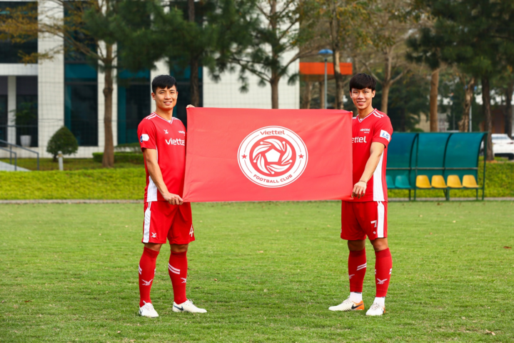
Viettel's new logo
The red and white colors used in the Viettel FC logo are also the traditional colors of the military team's uniform, and are the main colors in Viettel's new brand identity, representing youthfulness and new energy that contribute to the colorful tapestry of Vietnamese football.
Lieutenant Colonel Do Manh Dung, Director of Viettel Sports Center, shared: “The Viettel FC logo was unveiled as the V.League ball was preparing to roll again on the pitch after a period of interruption due to the pandemic. This is a great joy for us as we return to competition. I believe the fans are also looking forward to this: a new logo, a new image for Viettel FC.”
Captain Bui Tien Dung said: “Every time we step onto the field, looking at the flags bearing our team's logo gives us even more strength and motivation. Because those flags symbolize the strength of the military players, the spirit of unity, and the team's goal: we strive for the development of Vietnamese football and for our fans.”